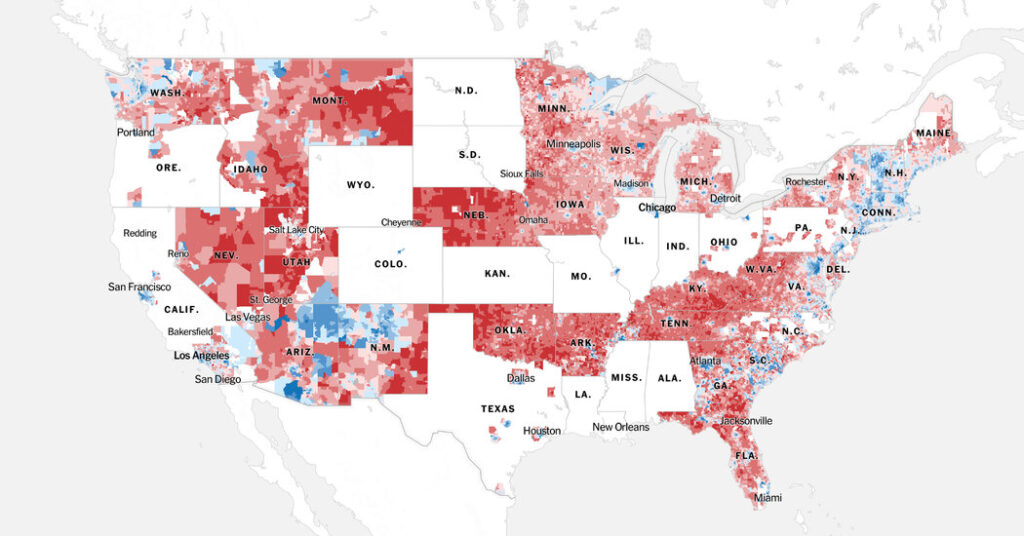
We’ve published a new interactive map of the 2024 election that shows results by precinct, the most detailed vote data available. The New York Times is also releasing this data set for others to use.
The map allows most Americans to look up how their city, neighborhood and even their block voted in the race between Donald J. Trump and Kamala Harris, and see how vote margins have shifted since 2020. It currently includes results for more than 110,000 precincts, or 73 percent of all votes, and will be updated as more data is collected.
We encourage readers to look up their hometowns and other places they’ve lived in, and to explore change from 2020, to learn more about the 2024 election. While Mr. Trump made gains in many areas to retake the White House, the detailed data reveals a range of geographic patterns and shifts for each candidate in different parts of the country.
Why we’re sharing this data
To produce the map, The Times spent months collecting results data and precinct boundary files from state and county sources. Each of these entities has its own way of releasing such data, and there is no nationwide source of this information. It is a time-consuming research task, so we decided to publish the data behind the map to allow others to use it for things like demographic analysis.
You’ll notice that some parts of the map are empty. We plan to publish updates to it and to the data set as we continue to collect and verify results, and a few states are already next on our list. For our initial map, we prioritized gathering counties with the most votes to include as much voter turnout as possible.
Still, some states and counties have indicated they will not provide precinct-level results for all votes cast in the election. Many places do not include early or mail-in absentee ballots in the precinct data they release, and since a majority of Americans now vote early or by mail, we consider the data for those places incomplete, and do not include them in the map.
How we did it
Gathering precinct data is a unique challenge. In some cases, results were readily available to download in nicely formatted data tables. In others, data was trapped in PDF files and had to be parsed. In a few places, data-curious individuals had already collected precinct data, and we got permission to incorporate their hard work into our map.
When it came to making the map, getting the results into a data table was only half the battle. The other half was putting the data into precinct boundaries, which change in every new election and have to be gathered manually.
As much as possible, we used official precinct boundaries provided by state or local officials. But the process of matching results to these precinct boundaries ranged from fairly straightforward to practically impossible because precinct names in results and boundary files were labeled or coded in ways that did not align.
Finally, we verified the information on our map by comparing the votes in each county to official results. In most cases, the figures matched perfectly. In a very small number of places, some data couldn’t be matched to a precinct and thus was not included on the map. Read more about our methodology here.
